Wednesday, October 19, 2011

To Drop or Not to Drop...

I pick up a lot of comics every month. Currently, just from Marvel and DC, I am reading Animal Man, Action Comics, Batman, Batman and Robin, Batwing, O.M.A.C, Punisher Max, Punisher, Moon Knight, Uncanny X-Force, Venom, Batwoman, Swamp Thing, Captain America and Bucky, Daredevil...and probably a few more. I am also reading the Avengers every month, written by Brian Michael Bendis, with art usually by John Romita Junior. I really enjoyed the book initially, although lately the Fear itself ties ins were losing me, as I don't usually read crossovers. At times the lack of central characters bothered me. I was beginning to feel like the book was too unfocused, and that too many characters were sharing the spotlight in every issue, almost like 20-some pages of cameos every month. I was prepared to drop the book this month.


Then, I saw the cover, which I think is just a great image. I think it captures,visually, what Bendis has been doing with the scripts on The Avengers. Bendis is fleshing out the personalities of the Avengers, with small conversational sections and text interview style pieces, with the team members talking about each other, what was currently happening in the book, and what it meant to each character to be an Avenger. I think these sections are really interesting, and do give the readers a bit more of a connection with some of the characters. Seeing Cap's hands rummaging through a pile of potential Avenger's pictures with his cup of coffee immediately (for me anyway) brings him down to earth and also still conveys him as the leader of The Avengers. I also love the selection of characters on the table (how awesome would it be to have Ghost Rider on the Avengers?!).


The artwork, by Daniel Acuna, sealed the deal for me. This is one awesome/beautiful looking super hero book. I loved every page of this comic, but the page above stood out to me. For the past few issues a romance has been budding between Hawkeye and Spider-Woman, and ex wife of Hawkeye Mockingbird has noticed...


Those three panels of Hawkeye giving Spider-Woman that rouge's smile, then getting caught, is just outstanding. It made me laugh out loud. The issue also sets up a pretty interesting future plot point, utilizing many of the major events that have taken place the last few years in the Marvel universe. This issue has made me decide to keep up with Avengers...I hope it stays this good.

-Eamon

Monday, October 17, 2011

Awesome Art from Recent Comics I Bought


So every now and then I like to share some art I think is awesome from the comics I am buying, this past week there is a lot of New 52 stuff, with some Marvel and a non big two entry. I have a Tumblr mostly for this purpose also, here. Frankenstein Agent of S.H.A.D.E, written by Jeff Lemire with art by Alberto Ponticelli, is a title I was not 100% sure about, but I couldn't NOT not buy the above cover, I think that image is superbly done and really funny. The below splash page was also very appealing. I very much enjoy the wonky way Frankenstein's face is drawn in the book.
Animal Man, also written by Jeff Lemire with art by Travel Foreman, is a superbly written book, but the artwork seems a little hit or miss to me. The below spread is definitely not a miss, and will have me back at the shop for issue number three next month...


Batwoman by J.H.Williams III and W. Haden Blackman is another beautiful book, and the art is always top notch and probably the best super hero comics has to offer, but I particularly enjoy the below spread because it takes the viewer through a crime scene in a way only a comic book could do. Bravo.

Speaking of the Bat-verse, the new Batman and Robin book is, in my humblest of opinions, extremely under rated. Pairing Bruce and Damian together makes for compelling comics. Bruce has a long way to go as a father, and this story does not shy away from that. He is cold to Damian sometimes, but you really can tell Batman is trying to be a good Father. Damian is at once sympathetic and chilling, a child torn between the expectations of his Father and his savage upbringing as a killer. There is a gut-wrenching spread I don't want to spoil with Damian in the Bat-cave that was at once very sad and frightening. I am really looking forward to the next issue. Also check out how Patrick Gleason draws Damian...perfect!


I love how intense Damian's face is in the above page...
...perfect. I also picked up the new Shade by James Robinson and Cully Hamner, which was a great book, but none of the panels jumped out at me as ones I needed to share, same with the new Swamp Thing by Scott Snyder and Yanick Paquette.
I still wish I enjoyed Grant Morrison and Rags Morales on Action comics a little more, but I trust Morrison so I'll keep with it, I really liked the below panel, especially the thin ink lines.


Also the cape panel is outstanding. Really fun/hilarious stuff here.

As for Marvel I picked up Uncanny X-Force number 16, Venom number 7, and the Newest Punisher Max by Jason Aaron and Steve Dillion. I LOVE Punisher Max, but this week's issue had so many surprises and twists, that it is risky posting a pic here...so I will make due with this over the top scene of carnage:


I also had the chance to pick up The Death Ray by Dan Clowes, and boy is it a sharp looking book...too big to scan though...


And that is that!

-Eamon

Monday, October 10, 2011

Manapul and Martin: Keepin' it Real in Superhero comics


Of the glut of DC new fiddy twos, another book I really enjoyed was the new Flash, with art by Francis Manapul (full credits above). I've never read a Flash comic before, and what Manapul is doing with the page layouts here is spectacular. I love this title page spread, using the letter shapes to introduce us to The Flash, and continues telling the story!


I love that page, it is probably my favorite opening spread I've seen in the New 52. Also for superhero comics I think that the blurb in the upper right corner explaining the Flash's origin is just perfect, and wish more comics and comic book movies would skip the lengthy origin and just jump right into the story! The artwork and page layouts are definitely the best part of this new issue of Flash, the story is enjoyable to read and develops some interesting starting conflicts, but these layouts are what is going to get me back to the comic shop to get the next issue. Pages like these are exhibiting storytelling techniques that only comics can do, and I love it. The below page is also a pretty sweet one,

and reminded me of another similar page in the recently collected 'The Amazing Spider Man Spidey Sunday Spectacular' by Marcos Martin and Stan Lee, which was one of my favorite comics purchases in quite some time. The 1st story is comprised of 2 page chapters that use the format extremely well.

Marcos Martin is a powerhouse, his is a world of classic superheroes transported to the here and now. There is a lightness and joy to how he draws superheroes and their world, his is a perfect blend of illustration and cartooning, and the story by Stan Lee here is really snappy and funny, I had a blast reading these. Lee is doing what he does best, that wiseacre banter, corny humor, and interesting, perfect word choice (Stan Lee's thesaurus must be pretty damn dog eared, if he even needs it anymore). There are so many funny moments and details in these Spidey stories, and the number of Marvel characters that appear is staggering, and it all works! One of my favorite examples is when Spidey visits Reed Richards (or Mr. Fantastic) for advice on a project. This could have been just a few panels of talking heads, but look what Martin puts in the background to spice up the story (also this could have been a direction in Lee's script):


I love little touches like these. Artists like Manapul and Martin are Pushing the envelope, and using actual cartooning to help their comics move, and keep lively, not be too bogged down by photo reference, filters and too many word bubbles. The recent Daredevil also yields a spectacular spread. Enjoy:

We need artists like these to continue to push the envelope, mixing old with new, to create some dope comics.

-Eamon

Sunday, October 9, 2011

Obligatory New 52 post: Office Management Amidst Chaos!!!


So DC comics did this line wide re-launch, 52 new issue number ones...if you are even a casual comics fan you know about this, and I don't really feel I need to go into THAT whole thing in this space. Now, I don't have the kind of money to actually buy 52 new comics so I have not read them all, but amongst my favorite titles are the new Batman, Animal Man (which seems to be everyone's fave), Batwoman (which I don't think should really count as a NEW #1) and The Flash. I like a few others, like Action comics (which I wish I liked it a little more) Batwing, Frankenstein and Aquaman, but head and shoulders above all of these, the title I cannot help but enjoy the most happens to be...

O.M.A.C! Created by Jack Kirby, with story and art by Dan Didio and Keith Giffen, inks by Scott Koblish, colors by Hi-Fi, letters by Travis Lanham and edited by Harvey Richards. As I understand it, O.M.A.C was Jack Kirby's update of Captain America for the future, where a scrawny loser named Buddy Blank (the new Steve Rogers) with a strong will gets transformed into an unstoppable super soldier. The original Omac stood for One Man Army Corps, he took orders from a giant eye shaped satellite in the sky known as Brother Eye. This new Omac (which now stands for One Machine Attack Construct) is Kevin Kho, who is transformed into Omac through his smart phone by the omniscient Brother Eye. What Kevin's ties to Brother Eye are at this point still remain mysterious, other than the fact that he works in an office building above a secret base Brother Eye needs to infiltrate. The plotlines of issue number one the new O.M.A.C and the old are relatively similar, Omac busts into an office, and Omac destroys it. I must segue, for a moment, to the original Omac for some inspired Jack Kirby predictions of office work in the future, however...

Buddy Blank is being picked on by people in his office, and his Supervisor (note the SUPER-V name tag, which is amazing) blames Buddy for having a persecution complex after his coworker literally PUNCHES HIM IN THE FACE. I mean look at him! Buddy is sent to the psychology section of the office to lose his frustration. The psychology section is a room with a few different doors, labeled 'silent room' and 'destruct room' and 'crying room'. Buddy picks the 'Destruct Room', where he sees this:


If modern day offices had rooms like this, I think everyone would be a lot less wound up. I like that one office worker is STABBING some UNSEEN dummy or piece of office technology. I also love the word bubble

"AAAAARRRR! DESTROYING THIS BOOK IS JUST WHAT I NEED!"

...another example of Jack Kirby's prophetic storytelling, just look at all of the recent bookstore closings. How could Kirby have foreseen this in 1974? The 'psuedo people' are my favorite feature about Kirby's vision of the future rat race. They are lifelike dummies that are bent over ass backwards so you can kick them down a rail into a granite wall. Absolutely spectacular. The thing about the original Omac series is that in every issue Jack Kirby included at least half a dozen awesome ideas that literally had me saying "wow!" or grinning ear to ear. The new Omac isn't as inventive, and that might be a little unfair because I am comparing the new creators to The King of comics himself. The toned down insanity also could be attributed to this O.M.A.C being a part of the shared DC universe, co-existing with characters like Animal Man and Batman. Nevertheless it is still a really fun read, and has scenes like this:

I really like that the new Omac's Mohawk is like an electric eel fin, that sparkles with raw energy. I think the book looks spectacular, and really appreciate all of the silliness. I think all of the issues are going to be titled with some variation on O.M.A.C (like issue number one's Office Management Amidst Chaos or issue number two's Odd Meals Assure Confrontation). I like how Brother Eye always replaces 'I' with 'eye' (for example 'Eye brought you here for a reason') and one of my favorite pieces of writing in the issue...

OMACTIVATE!

... is priceless. They inject a lot of Kirby and DC universe nods in here, and I love every second of it. This book doesn't take itself too seriously, it isn't grim n gritty, it doesn't offend any of my sensibilities. So far it is just good clean comics fun, and that is in startlingly low supply in superhero comics these days. I have no idea if anyone is reading this book, but I hope you are, dear reader, and that it continues for a good long run.

-Eamon

Monday, October 3, 2011

Captain America and Bucky is the best looking superhero comic on the shelf.


Dc New 52 blah blah blahs aside, the one comic I think EVERYONE should be talking about (and it is a Marvel book) is Captain America and Bucky, with Ed Brubaker and Marc Andreyko on writing, Chris Samnee on art, Bettie Breitweiser on colors and Joe Caramagna on letters. Most of the buzz I have been reading on a Marvel book has been for Daredevil, by Mark Waid, Marcos Martin and Paolo Rivera, and don't get me wrong, that praise is extremely well deserved. The new Daredevil is one of the best comics out there now, and certainly a cut above most superhero books being released.


...But hot DAMN Chris Samnee is on fire, as is colorist Bettie Breitweiser. I'm not sure whose work on this book I like more, Samnee's or Breitweiser's. Samnee's art is the PERFECT combination of superhero style comics illustration, mixed with pure cartooning and a splash of Norman Rockwell. His inks are milky pools of black, they are like dessert, so satisfying and thick.
It's obvious he uses a lot of reference, but he draws every last bit of it, he doesn't just scan a photo and use posteredges to make it look like a drawing. Almost every panel has a background, and if it doesn't, there is a visual reason or excellent coloring choices that make it ok. Everything looks right, nothing is confusing, and it all looks damn good. If there are characters in the background, they are all individuals, and they are interesting to look at. Every panel tells a story. Some specific examples of what I'm talking about below...look at those clowns! Look at that train!


The action is exciting, and it's pure WWII pulp style storytelling, played a little less over the top than the Simon and Kirby Cap stuff, but the art is just spot on. I enjoy the story so far, which mainly focuses on the exploits of Cap and Bucky from Bucky's perspective, but the artwork is just so astounding that it is all I want to talk about. To be honest, the two mesh together perfectly, I can't really separate one from the other, which is PERFECT AND WHAT ALL COMICS SHOULD DO. Sometimes you might read a comic, and go "Hey, that was a great story, but the art just wasn't doing it for me" or vice-versa (I think a perfect example of the vice versa would be Jeph Loeb and Tim Sale's Catwoman: When in Rome story, fan-freaking-tastic visuals, but definitely one of the worst written comics I own).


It is interesting to see the transformation of Bucky from a troubled but well meaning kid into a killer. It is also a little bizarre that the younger Bucky seems almost more bloodthirsty than the older Captain America, but he is still a kid, the three panels below show ways that the artists convey those sides of Bucky... the cold blooded killer and the young soldier looking to impress, still unsure of himself.


The colors are digital, but they don't advertise it. The textures almost make the colors look painted, and they don't just serve the inked artwork, they enhance them, they make them look even better. I'm convinced that if this book was colored by someone else it would not look nearly as good. This book is a feast of comics storytelling, I feel like I get my $2.99 value with each and every issue. My only real qualm with this book is why Samnee isn't doing the covers. This is a perfect example of "don't judge a book by it's cover" because I think as cover images these issues have pretty unremarkable ones.

I would expect this book to be all over the web, pages and panels being tumbled, 5 star reviews on comics websites...maybe I'm just not looking in the right spots, but if you see this book BUY IT NOW. Let's not have another Thor The Mighty Avenger here people.

-Eamon

Tuesday, September 27, 2011

The World's Greatest Detectives


I recently picked up a comic that featured The Batman and Sherlock Holmes, arguably the two most famous fictional detectives of all time. The story is an extra long Anniversary issue (Detective's fiftieth!) which was written by Mike W. Barr, with Art by Alan Davis, Terry Beatty and Dick Giordano, Carmine Infantino and Al Vey, E.D.Cruz (and a Pinup by Dick Sprang!). Colors by Adrienne Roy and Carl Gafford, and letters by John Workman, Romeo Francisco and Todd Klein. It was a team up that was too good to pass up, and this cover is definitely what prompted me to buy it, without looking at the interiors.

Aside from Holmes and The Dynamic Duo, we also get other DC detectives Slam Bradly and the ductile detective himself The Elongated man.


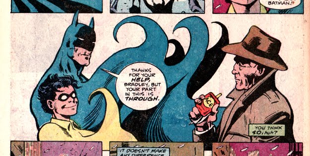
The story opens Philip Marlowe style, (or more appropriately Sam Spade style?) with Slam Bradley mourning his recently deceased partner in his lonely office, whereupon two sets of visitors, one a dapper Londoner looking for his missing fiancee, the other a set of gun wielding crooks, find their way into Slam's office. Slam and his new client escape into the alleyway, and are cornered, but are rescued by the dynamic duo Batman and Robin!


Batman does something here that immediately made me freeze in my tracks, however. A crook fires an automatic weapon at The Dark Knight, who quickly shields himself with the body of a thug he was walloping in the face. That crook HAS to be dead and as we all know, The Batman does not kill! (The panel of Batman just cold-cocking the thug over and over is amazing though.)


The other thing I noticed, not surprisingly, is what an amazing artist Alan Davis is. I am particularly taken with the way he draws the boy wonder himself, Robin! His expressions fit the character, and his grace and fluid movement in disabling crooks is amazingly depicted by Davis. Look at the joy as he effortlessly takes down all those thugs. These drawings of Robin might be my favorite iteration of the character in how he is depicted visually, at the very least it is one of my favorite aspects of this comic.


The comic is book-ended by the Alan Davis drawn sections with Batman and Robin, in the middle we get stories featuring Slam Bradley, The Elongated Man, and Sherlock Holmes and Dr. Watson. The Slam Bradley section opens with another direct reference to The Maltese Falcon by Dashiell Hammett (the first being Slam's dead partner in the beginning).


Slam does some fairly action-movie/comic booky detective stuff, including throwing a gasoline can at some approaching armed crooks and shooting it from afar to make it explode, distracting the thugs so he can run up and punch them out (if he was that good of a shot couldn't he have just shot them all? He shoots someone at the start of the comic...). Slam also discovers that his client is a descendant of the evil Dr. Moriarty, and the kidnapped fiancee was actually a descendant of Dr. Watson! This leads to a story with The Elongated Man, who just happens to be in London. He is walking by 221b Baker street, when Sherlock Holmes' former lodgings are assaulted by Moriarty's other descendant, this one following the family tradition more closely, who is looking for a lost manuscript of one of Sherlock Holmes' unpublished cases that could ruin his CURRENT plan to blow up the Queen and launch some missiles. I wish I enjoyed the middle section as much as the Batman start and finish, and there are plenty of references to the classic Conan-Doyle Holmes stories to clue the reader in that Barr knows his Holmes, but for me the Holmes story in this just falls flat and makes me see how great Sir Arthur C0nan Doyle's original stories really are.

An insane SPOILER ALERT to a comic published in 1986, the final baddie is apprehended by none other than the ORIGINAL Sherlock Holmes with some Baritsu (this is a reference to the martial art Holmes used to defeat Moriarty when they were locked in mortal combat over Reichenbach Falls in the original stories). Holmes sustained his long life "thanks to a proper diet, a certain distillation of Royal Jelly developed, in my beekeeping days, and the rarefied atmosphere of Tibet,where I keep my primary residence". This is pretty nuts, but in a way, totally appropriate. as Batman has said "Batman and Robin will never die" the same can be said for Sherlock Holmes, a multi media phenomenon of a character who is still having movies and television series made depicting his adventures today. It reminded me of the ending to Paul Pope's Batman Year 100 (MORE SPOILERS), where it is heavily implied that the Batman featured in Pope's story is still Bruce Wayne, even though he would be unbelievably ancient or dead in the time period that tale takes place.

The sense of fun, the art work and bevvy of classic Sherlock Holmes references are all here, I just wish I liked the comic a little more, and that the mystery made a little more sense. Anytime I get to see Sherlock Holmes and Batman depicted by Alan Davis, however, is an opportunity I would never want to miss.

-Eamon

Thursday, August 4, 2011

The Best Page in The Avengers Marvel Masterworks edition


I was flipping through my edition of the Avengers Marvel Masterworks edition recently and came across what may be my favorite page of avengers comics ever. Captain America is moping after working out with a bunch of big bruiser type wrasslers,

"all my training--all my skill--and STILL I was unable to save Bucky years ago!"

...and in walks the Avengers intern Rick Jones DRESSED LIKE CAP'S DEAD PARTNER. The expression on Cap's face is spectacular.


An aside...This page is just as fun and exciting as any action sequence, a testament to Mr. Jack Kirby... Seeing Rick Jones as Bucky makes Cap FLIP THE FUCK OUT, and screams at Rick to take off the costume, and snatches the domino mask off of Rick's face. I like to imagine, after that, Cap begins sobbing while pointing at Rick-Bucky to get out of his room, but he probably just has his head buried in his hands. Please read these three panels...they are amazing.


Hope you enjoyed it as much as I did folks! Or else...


-Eamon